![]()

Saloni Garg designed these business cards for Mag Swim, a revolutionary body-positive swimwear brand.
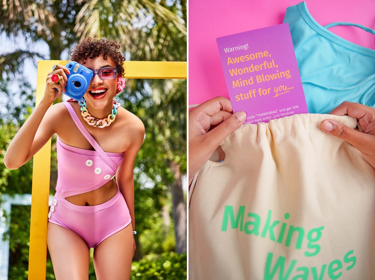
According to Saloni, Mag was founded on the belief that everybody is a beach body.
“The founder, having gone through the ordeal of finding a perfect swimsuit for herself, decided to create a swimwear line that celebrates all bodies and empowers women to feel confident and comfortable in their own skin.”
Brand Image & Logo Design
At the heart of Mag Swim’s visual identity there lies a fun and quirky aesthetic.
Saloni said that the brand messaging is edgy and empowering. It challenges the norms and expectations of the fashion industry and society.
“The wordmark is bold and playful, and the letterform curves are a subtle reminder of sea waves. They also hint towards a woman flaunting her body curves.”
At the same time, the brand hopes to inspire self-love and confidence in its customers and invites them to be themselves while also being part of a group that doesn’t care what other people think.
![]()
Typography & Colour Palette
Apart from the customized logo, the typeface used in the visual identity is called Market Pro. It’s a display typeface by H.A. Simon and published by FontFont Foundry.
Saloni explained that the font imitates a person’s handwriting and adds character to the brand.
The primary typeface, Fira Sans, is a humanist sans-serif typeface that is specially optimised for legibility.
As Saloni puts it, “It is a humble supporting actor balancing the brand’s bold and playful designs.”

As for the colour palette, it celebrates the beauty and diversity of women’s bodies with a lively and expressive combination of colours.
The blue represents confidence; the yellow, happiness and optimism; the orange represents warmth; the purple represents uniqueness; and the cream adds balance.
Besides that, Saloni incorporates doodles in the form of arrows or circles and underlining to add a unique flair. Circles and underlines are used to emphasise things, while arrows are used to indicate them.
Printing of Business Cards
These business cards were printed by Sai Advertising Services Pvt. Ltd. in Chandigarh, India.
These cards were printed with matte lamination for that subtle, sophisticated finish.
More Business Card Ideas You May Find Interesting:
- Handwritten font business cards
- Curved Shapes/Curved Elements business cards
- Fashion business cards
- Large Typography business cards
- Multiple Versions business cards
Check out our Business Card Categories to find more business card ideas.


Designed by Saloni Garg
Printed by Sai Advertising Services
For Mag Swim


