![]()
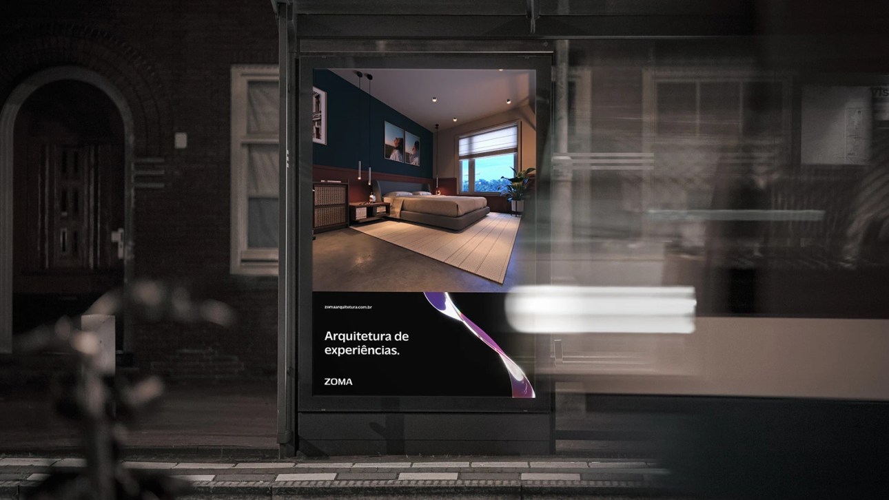
João Vitor Menezes designed these business cards for ZOMA, an architecture studio that revolutionises user interactions with their surroundings using the latest virtual reality technology to deliver amazing client experiences.
Connective Architecture, also known as ZOMA, stands out as a studio in the world of architecture that not only designs architectural and scenic spaces but also creates immersive experiences using advanced technology.
João took on the challenge of redesigning the brand’s business card, aiming to preserve the brand’s essence while updating its design and positioning.
Brand Image
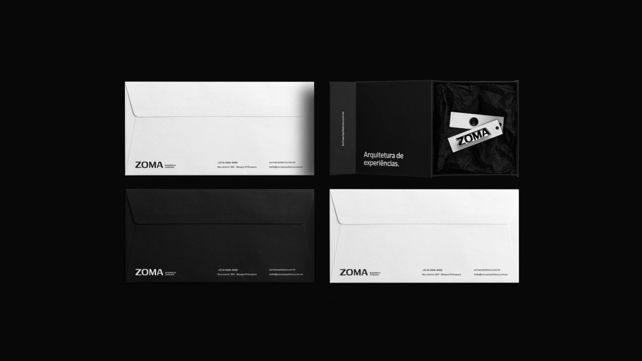
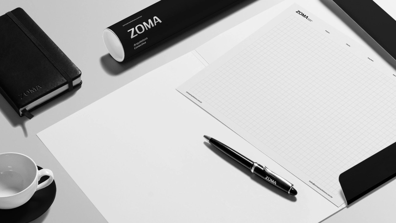
ZOMA’s goal is to provide transformative experiences for its clients. Also, it was necessary for the brand to have strong and distinct elements without sacrificing simplicity or the ability to highlight the work done by the company.
Therefore, the business card design needed to reflect an elegant and professional image while conveying the technological era in which the company operates.

Logo Design & Typography
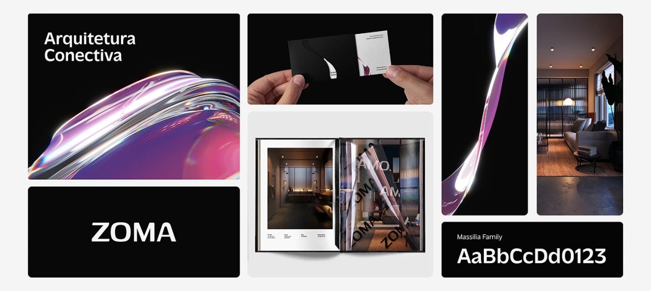
For the brand’s logotype, João opted for Genos, a bold and modern typeface from Google Font.
He explained, “The previous font used was too thin and fragile. The rebranding needed a solid and stable typeface, but with something unique and modern to it.”
While browsing and testing types, the letters ‘O’ and ‘A’ in Genos stood out to him. The new logo not only eliminates the need for additional symbols (as seen in the previous design), but also seamlessly aligns with ZOMA’s image, setting it apart from competitors.
On the business card, Massilia complements the main typeface with its soft and delicate quality, which is perfect as the body text!
Colour Palette
The colour palette plays a pivotal role in conveying the studio’s futuristic approach.
According to João, the magenta-to-blue gradient was suggested by clients at the first briefing, “They brought me a photo that they felt represented the brand’s concept and it had those colours.”
“So, I tried to add a blue and magenta hue to the glass-like elements to make it more unique than just plain glass, and it came out great!”
Along with the black-and-white colour palette, the 3D element gives the graphic system a futuristic feel while adds depth to the overall design.
Cut-Out Holder
With its die-cut holder, ZOMA’s business card distinguishes itself in a sea of conventional designs. Inspired by the desire to showcase the 3D graphic as the focal point, the cut-out holder also ensures that the futuristic element catches the client’s eye immediately, making a lasting impression.
“The focus of the rebranding was to make the studio stand out from its competitors, who always used the same colours and ideas for their visual system,” João said.
“The business card was designed to match the uniqueness and futuristic approach of the brand. Since the main element of the brand is a 3D graphic, it needed to be the first thing that the client sees.”
“That’s why I decided to add a cut to the holder so that it appears first.”
Printing of Business Cards
While the provided designs here are mockups, João envisions printing the business cards with Spot UV on the 3D graphic.
The goal is for the element to mimic the glass look, providing a tactile and visual experience that aligns with the studio’s commitment to delivering immersive and memorable first impressions!
Overall, ZOMA’s business card design has successfully represented the studio’s identity and shows the brand’s dedication to pushing boundaries in the field of architecture and design.
More Business Card Ideas You May Find Interesting:
- Architectural business cards
- Futuristic business cards
- Holographic business cards
- Unique (ideas) business cards
- Unique Shaped business cards
Check out our Business Card Categories to find more business card ideas.






Designed by João Vitor Menezes
For ZOMA


