![]()

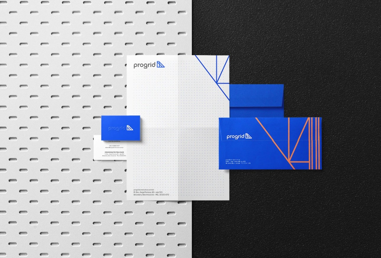
Moscou Design designed these business cards for Progrid Construtora, a construction company in Brazil.
“During the naming process, we had the intention to make the brand name highlight the use of the steel framing technique, a method that, although little utilized in Brazil, is more sustainable and has a high production capacity,” said Matheus Augusto, one of the Designers at Moscou Design.
“We used ‘grid’ to evoke the technical and specific character of the steel structure, and we added the prefix ‘pro’ to convey an idea of progress and modernity. Subsequently, we developed their visual identity and the website.”
![]()
![]()
![]()
Explaining more about the logo design, Matheus said, “This company’s characteristics allowed us to create an image of strong geometric inspiration and a brand positioning that pointed towards a new notion. The geometric shapes have steel structures that allow direct inspiration for the brand’s imagery universe. In the symbol, we chose rounded corners to remove some of the ‘hardness’ present in the metallic shapes produced.”
“The typography of the logo was created from simple yet striking shapes, allowing integration and at the same time contrast with the diagonal lines of the symbol and graphics,” he added.
The embossing printing method was applied to the business cards for a sense of dimension and tactile experience.
Feel free to visit our Business Card Categories section to find more business card designs.


Designed by Moscou Design
For Progrid Construtora


