![]()
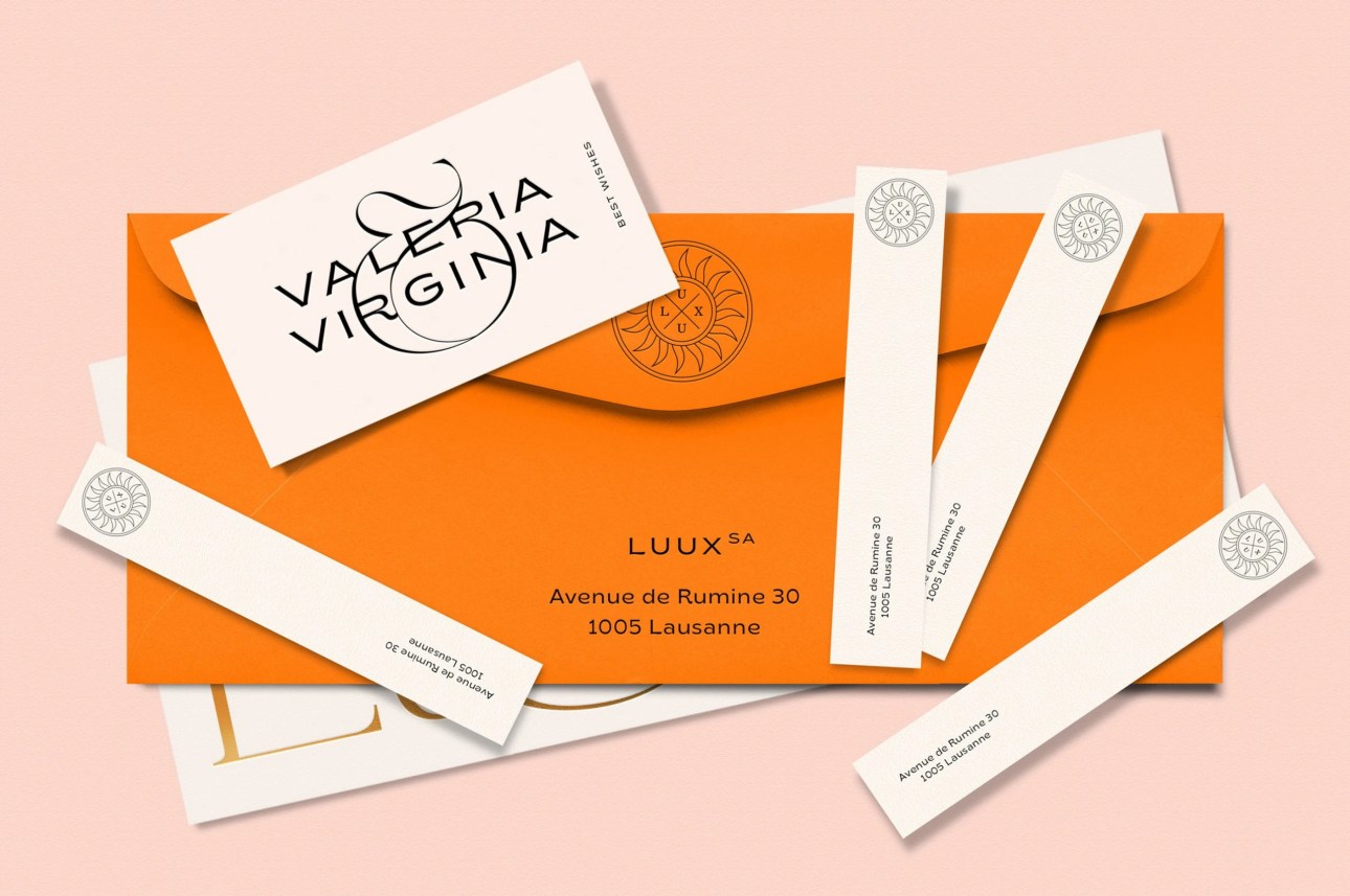
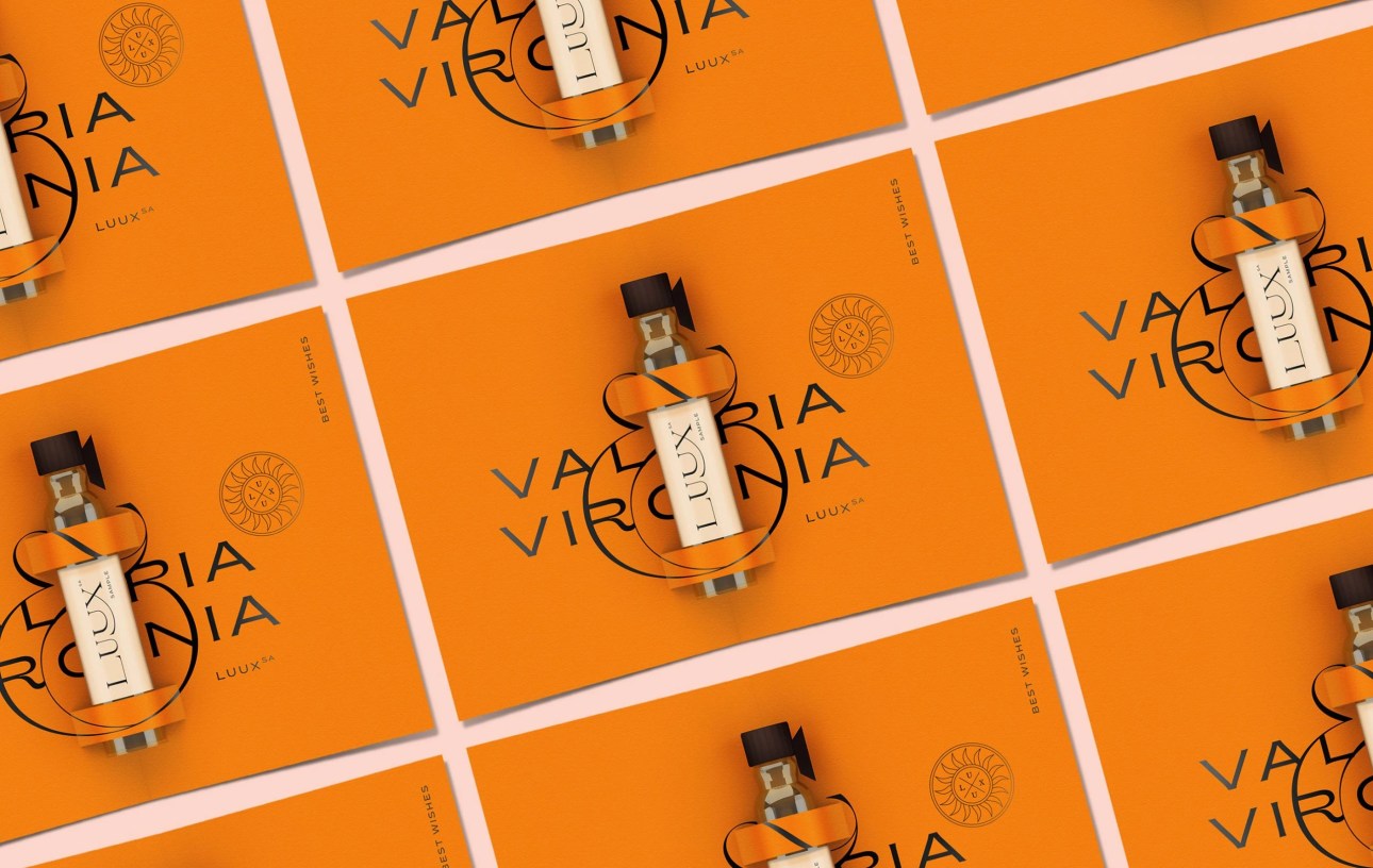
Kissmiklos designed these business cards for LUUX, a Swiss company founded by two women named Valeria and Virginia, which helps to build luxury brands, mainly focusing on perfumes.
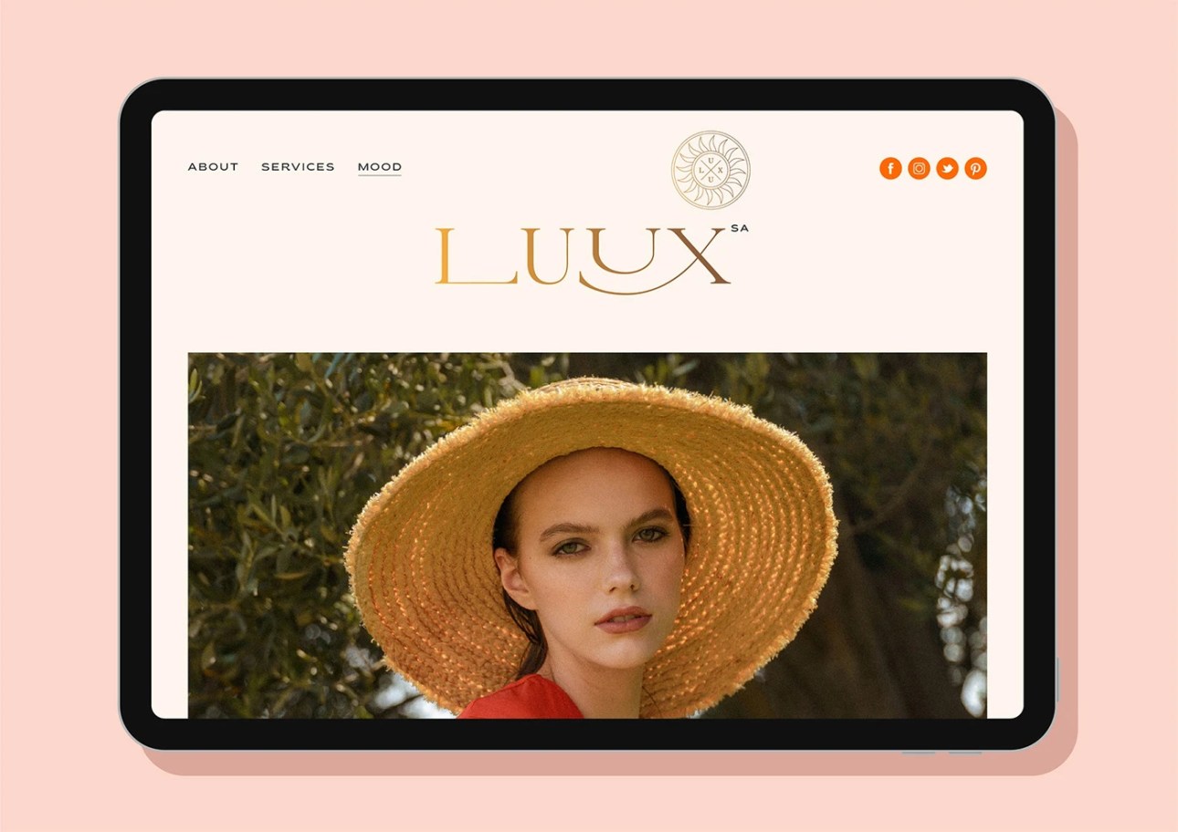
“The double U in the logo means ‘Valeria & Virginia’ as U = V in Latin. The word LUX means ‘light’ in Latin, which is why I designed a sun symbol as part of the logo,” Kissmiklos said.
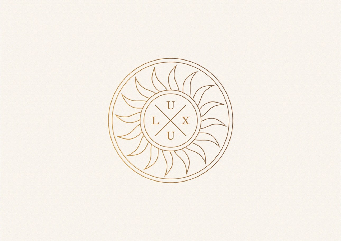

The logo construction can be understood as this: Valeria+Virginia = VV = UU (V = U in Latin), thus the brand name, LUUX.
On the back of the card, a smooth connection is shown between the founders’ names using an ampersand and its curving lines.

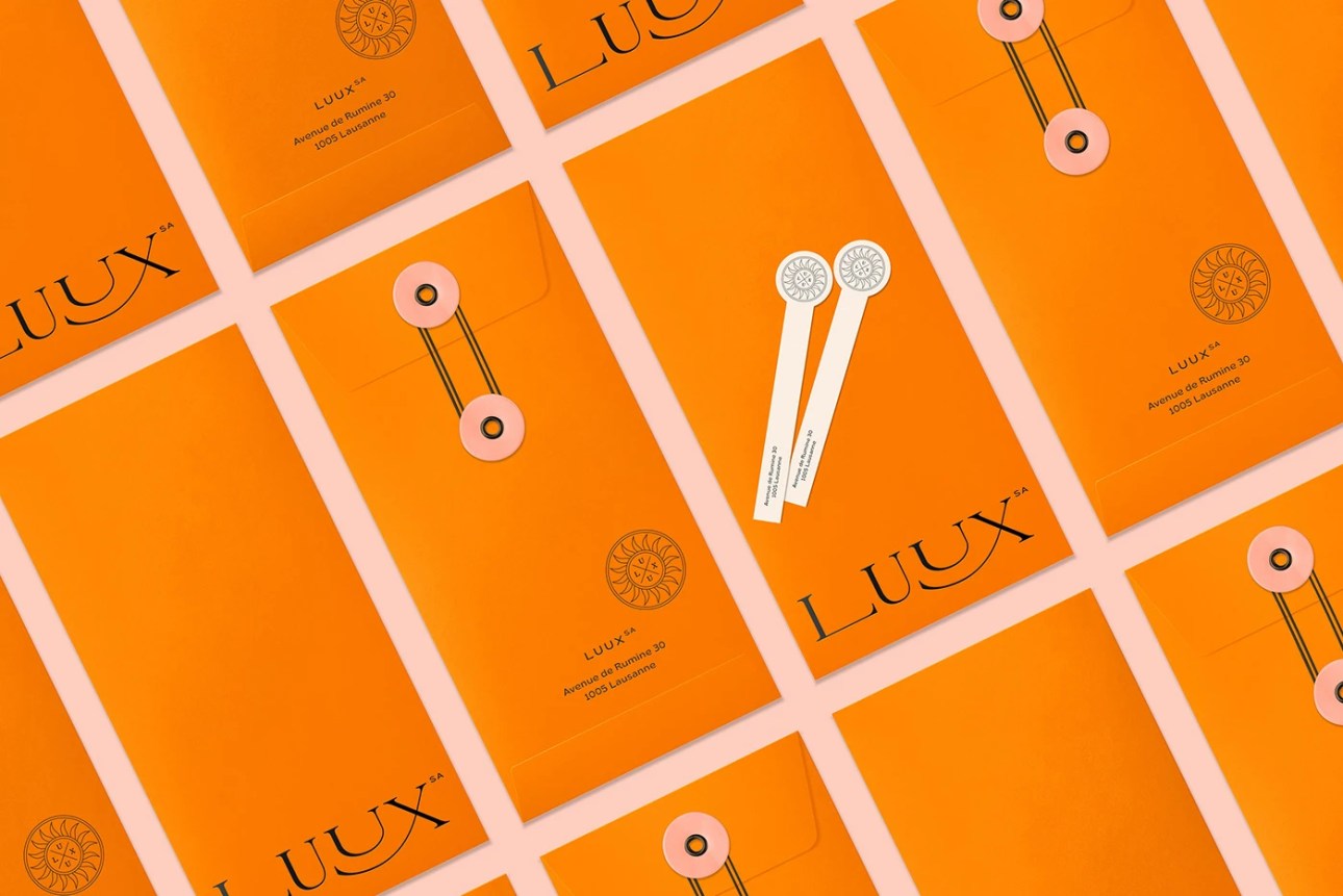
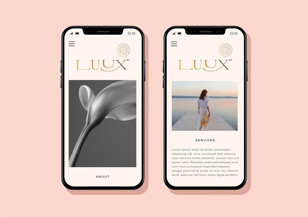
Speaking of the colours and typography used in the visual identity, Kissmiklos said, “I wanted to express a shiny and warm feeling, therefore I mixed the elegant, pure pastel pink and the pale butter colours with a strong, vivid orange. The gold always symbolized the real luxury lifestyle.”
“The playful, fashionable but a bit edgy logotype follows nowadays luxury trends, what is not always conservative but rather qualitative and characterful. I chose a really nice and interesting typeface called Brice for the information part of the card.”
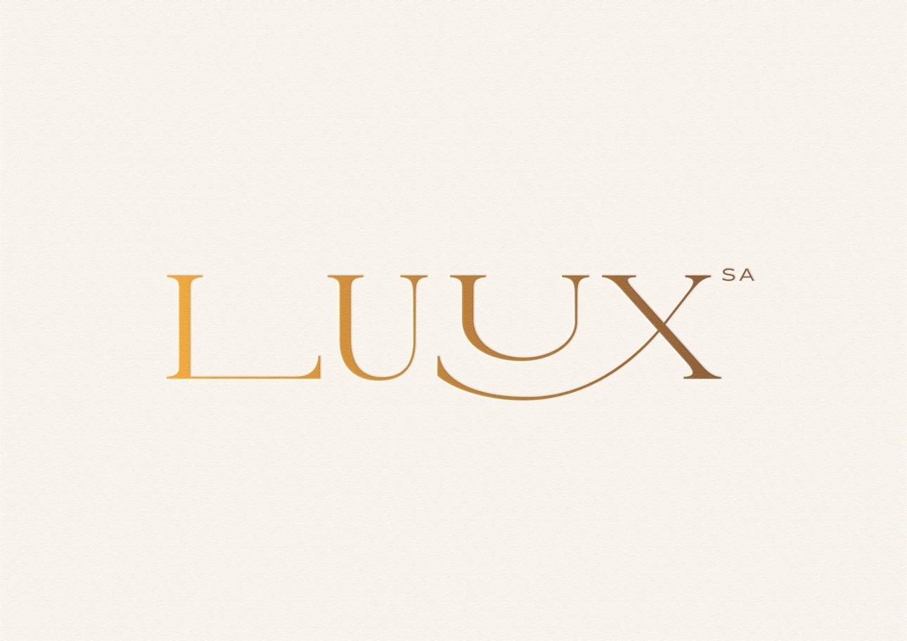

Although not directly involved in the card-printing process, Kissmiklos did share with us his printing suggestions, “I hope the business cards will be printed on a Fedrigoni, lightly structured paper with either letterpress or embossing and gilding.”
Overall, it’s a clean and sophisticated business card design that pleases the eye!



Designed by Kissmiklos
For LUUX


Good