![]()
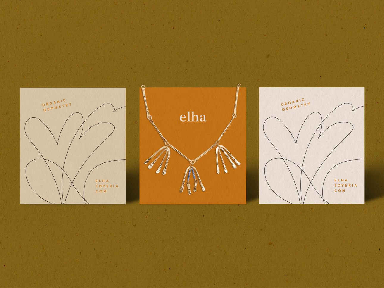
Mónica Andino designed these business cards for Elha, a jewellery designer based in Costa Rica.
“Elha is avant-garde and classic at the same time. It extracts organic forms of nature and converts them to new meanings that can lead to avant-garde sculptural pieces without neglecting the classic principles of jewel design,” Mónica said.

Typography & Colour Palette
The business card design is using neutral colours, an intuitive organic line for texture and minimal type, to reflect the brand jewelry design.
The logotype is a combo of a serif and sans serif font. According to Mónica, “I chose a classic serif due to its elegance and timeless design. Then, I combined it with a classic Egyptian san serif, because I wanted to create a minimal and elegant design, similar to the brand’s product.”
“For the stationery, neutral colours are playing well with each other, reflecting the colour of the skin behind a piece of jewellery. The typographical decisions achieve a geometric balance in contrast to the texture of organic lines.”


“I drew lines with flowery themes over the negative space to give it a sense of softness and femininity. Also, it creates a nice background scenario for the main piece of work – the jewellery itself.”
These business cards are not printed but if they were, “The cards would be offset-printed. For the paper, I’d recommend using Butcher Extra White Dur-o-Tone 100lb cardboard paper, from French Paper Company.” Mónica suggested.


Designed by Mónica Andino
For Elha


