![]()
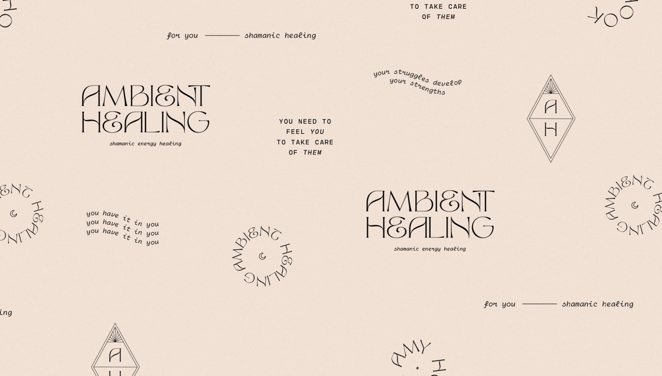
Kaye Huett designed these business cards for Ambient Healing, owned by Amy who works in Shamanic Reiki to promote a calm, balanced shakra for her clients.
Ambient Healing reinforces the clients’ inner strength and healing whilst allowing them to take on the general stress of life with a clear and happy state of mind.
“We wanted to create a brand that felt calming and natural with an underlying current of strength and power,” Kaye said.

Typography & Colour Palette
The primary typeface used is Tan – The Whistling and the accompanying typeface is Cartograph. Both are beautiful fonts that work well together.
“As for the colour palette, we used pastel, dusky and natural tones to further strengthen the healing energy that Ambient Healing provides. These tones offer an immediate sense of calm and tranquility.”
“The colours especially appeal to Amy’s target audience of mothers struggling with the day-to-day pressures of parenthood by not being garish or bold.”
“Think of the feeling of a dull golden glow of a subtle light during night feeds; it allows for a relaxing, quiet and comforting experience for mother and baby.”


Kaye and Amy wanted the cards to be in square shape and to have multiple aspects of the identity on them, such as the positive affirmations.
That way, Amy’s clients could regularly be reminded of the positivity she aims to instill. Clever idea!
These business cards were printed by MOO using a soft touch card with a spot gloss finish on certain typeface.


Designed by Kaye Huett
Printer by MOO
For Ambient Healing


